Single Cell RNA-seq
Xyna.bio integrates a range of tools for the analysis of scRNA-seq data, enabling an easy setup of customized analysis pipelines. Here, the integrated nodes are mentioned in order of usage in the pipeline.
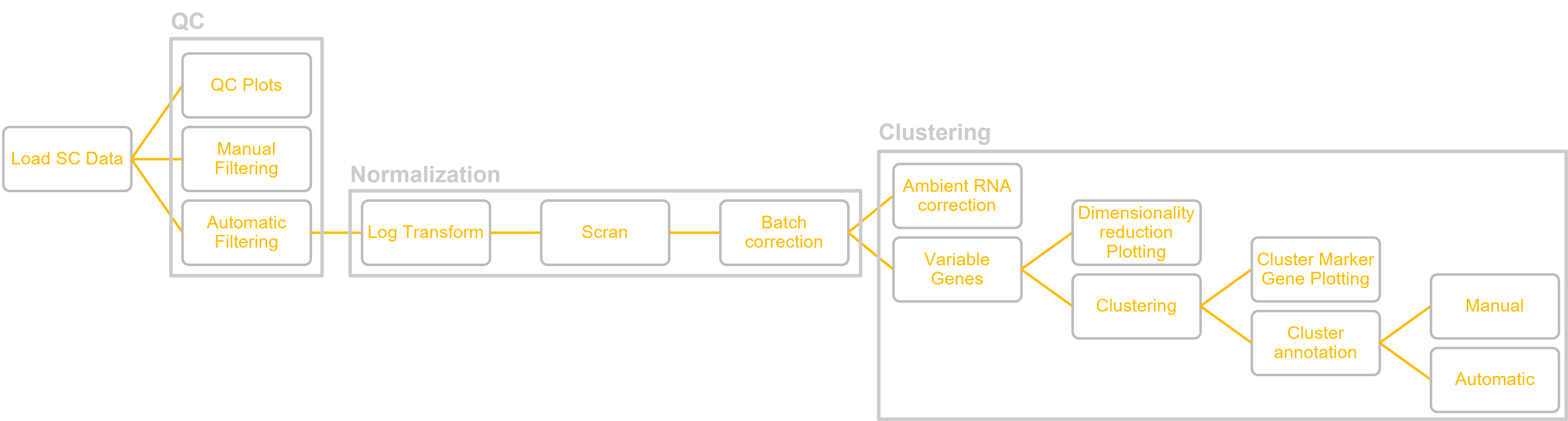
In the following figure, you can see the outline of the pipeline:
Load Single Cell Dataset
Loads a .zip file containing scRNA-seq data. The dataset can be further processed with the integrated single cell pipeline.
Input:
The input is a zip file containing processed scRNA-seq data. The file must contain a folder which contains one folder per condition. Each of these folders must contain three files:
- A tsv file containing barcodes: must have barcode in file name
- A tsv file containing genes: must have gene in file name
- A mtx file containing the matrix
The files are often generated with CellRanger. A potential source for scRNA-seq datasets is the Gene Expression Omnibus.
Input Parameters:
- Prefix: Must be provided if the gene name in the gene file contains a prefix.
Output: (Reference to) Single Cell Dataset
SC QC Plots
Plots Quality Control (QC) plots for the scRNA-seq dataset. The plots can be visualized with Image Viewers (see Visualization).
Input: Loaded single cell dataset (filtered or unfiltered)
Output (available plots):
- Counts by sample: Violin plot of number of counts per sample. A violin plot plots the distribution of data similarly to a boxplot, but with added indication for the number of samples in each segment of the distribution. A low number of counts per sample together with other factors is indicative of low quality data.
- Mitochondrial fraction by sample: Violin plot of the fraction of mitochondrial RNA per sample. A high mitochondrial RNA fraction percentage, together with other factors is indicative of low quality data.
- Total counts: Histogram of the total number of counts, also known as library size. A histogram is a plot of one dimensional distribution, collecting values in a numerical range into bins and hoswing how many samples were counted per bin. The distribution of counts can be an important indicator of data quality and should approximately follow a normal distribution, otherwise filtering needs to be applied.
- Genes by counts: Scatterplot of the number of genes by cell vs number of counts.
- Total genes: Histogram of the total number of genes.
Manual Filtering
Filters the SC dataset by manually set thresholds for different parameters. Can be used as an alternative to Automatic Filtering.
How to filter the data is dependent on the individual dataset. You can use the QC plots to decide on the filtering method.
Input: Unfiltered single cell dataset, usually directly from Load Single Cell Dataset node.
Input Parameters:
- Min counts: Minimum threshold for number of counts per barcode.
- Max counts: Maximum threshold for number of counts per barcode.
- Maximum MT fraction: Maximum threshold for mitochondrial fraction in percent.
- The value is a numeric value.
- Minimum number of genes: Minimum threshold for number of genes.
Output: Filtered SC dataset. Can be further processed in the scRNA-seq pipeline. If desired, you can plot the QC plots again to double-check the distributions.
Automatic Filtering
Filters the SC dataset under the assumption of a normal distribution by removing outliers according to Median Absolute Deviations (MAD) and the maximum mitochondrial fraction. Can be used as an alternative to Manual Filtering.
Input: Unfiltered single cell dataset, usually directly from Load Single Cell Dataset node.
Input Parameters:
- MAD: Median Absolute Deviation of counts (example value: 5)
- MAD MT: MAD of mitochondrial counts (example value: 3)
- Mitochondrial_fraction: Maximum threshold for mitochondrial fraction in percent (example value: 8)
Output: Filtered SC dataset. Can be further processed in the scRNA-seq Pipeline. If desired, you can plot the QC plots again to double-check the distributions.
Normalize
Normalization of the scRNA-seq dataset based upon scran The first step of the standard processing pipeline of pre-filtered single cell datasets.
Input: Pre-filtered single cell dataset
Output: Normalized single cell dataset
Log Transform
Log transformation of the pre-filtered and normalized single cell dataset. The second step of the standard processing pipeline of pre-filtered single cell datasets.
Input: (Normalized) single cell dataset
Output: Log-transformed single cell dataset
Batch Correction
Corrects for batches from scRNA-seq experiment. The third step of the standard processing pipeline of pre-filtered single cell datasets.
Input: (Log-transformed) single cell dataset
Output: Batch-corrected single cell dataset
Variable Genes
Extracts only the highly variable genes. Genes that are the same across all of the data are filtered out. The fourth step of the standard processing pipeline of pre-filtered single cell datasets.
Input: Fully processed single cell dataset.
Input Parameters:
- Number of top genes: Number of top genes that should be selected. (example value: 4000)
Output:
- Variance analyzed: Single cell dataset containing only the extracted top genes. Can be used for clustering.
- Variance plot: Plot about variance across the dataset. Can be viewed with Image Viewer.
Leiden Clustering
Clusters the data with the Leiden algorithm. The fifth step of the standard processing pipeline of pre-filtered single cell datasets.
Input: Fully processed single cell dataset that only contains the top variable genes.
Input Parameters:
- Resolution: Numeric value between 0 and 1. The lower the value, the larger the clusters. (example value: 0.5)
- Clustering Name: Set name of clustering to refer to it later in the pipeline.
Output: Clustered single cell dataset. Can be further used to plot dimensionality reduction, get marker genes, or conduct DGE analysis.
Citations:
V. A. Traag, L. Waltman, and N. J. van Eck. From louvain to leiden: guaranteeing well-connected communities. Scientific Reports, March 2019.
Dimensionality Reduction Plot
Plots clustered single cell data in a dimensionality reduced representation. Multiple representation options are available. The clusters need to be annotated manually by the user with the help of the marker genes, as explained, for example, in this tutorial
Input: Clustered single cell dataset, usually from Leiden Clustering node.
Input Parameters:
- Dimensionality reduction type: Algorithm for dimensionality reduction. Selection between UMAP, PCA, t-SNE, diffmap, Graph.
- Attribute to color by: Attribute by which the dimensionality reduction should be colored, usually the name of the previous clustering.
Output: Generated plot that can be viewed in Image Viewer.
Plot Gene
Plots the clustered single cell dataset dimensionality reduced by UMAP. Highlights the number of counts of one specific gene across all samples, allowing to judge the distribution of said sample. This can be useful when checking for the distribution of certain marker genes during the annotation of clusters.
Input: Clustered Single Cell dataset, usually from Leiden Clustering node. Alternatively, an unclustered dataset can be used.
Input Parameters: Gene name by the distribution of which to color the dimensionality reduced data by.
Output: Generated plot. Can be viewed with Image Viewer (see Visualization).
Get Marker Genes
Gets the top n marker genes for a clustered single cell dataset. The marker genes can be used for the manual annotation of the clusters.
Input: Clustered single cell dataset, usually from Leiden Clustering node.
Input Parameters:
- Clustering Name: Name of the clustering from which the marker genes should be retrieved. The name was defined in the previous Leiden Clustering node.
- Minimum filtering fold change: Minimum threshold for the fold change (how much gene expression changed). (example value: 0.5)
- N genes: Number of genes to plot/return per cluster. (example value: 3)
Output:
- Plot of Marker genes:
- Table of Marker genes: Csv file that can be manually downloaded and analyzed.
Differential Gene Expression Analysis
Computes Differential Gene Expression (DGE) Analysis comparing two clusters.
Input: Clustered single cell dataset, usually from Leiden Clustering node.
Input Parameters:
- Name of clustering: Name of the clustering from which the marker genes should be retrieved. The name was defined in the previous Leiden Clustering node.
- Cluster one: Name of cluster 1 to compare. The clusters are named from 0 to #clusters – 1 according to the dimensionality reduction plot.
- Cluster two: Name of cluster 2 to compare. The clusters are named from 0 to #clusters – 1 according to the dimensionality reduction plot.
Output: Differential Gene Expression Table as csv that can be manually downloaded and analyzed.